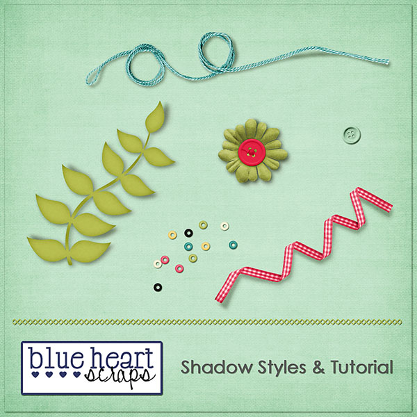
Hello scrappers!! Kelley here to start out the week with a shadowing tutorial for you as well as a set of freebie shadow styles! The tutorial covers how to add dimension to your ellies like ribbons or strings. The freebie shadow style set includes 2 sets of styles – 1 for light papers and 1 for dark. I hope you enjoy!
You can DL the freebie shadow styles set by clicking here. 🙂
Sooo, lets get started with the tutorial!
The first thing I always do when I shadow is place my item, then either click on the shadow style that I want to apply, or click on the fx button to apply a new shadow. Using these styles, you’ll just click on the style’s button in your style palette. For example, if you are placing a button on a light background paper, you’ll click on the button basic shadow style. Once you apply a style, you can always edit that shadow to your liking selecting the layer you want to edit on your layers palette and then clicking the fx button and then drop shadow. Just pull the sliders to adjust to your liking as usual. That is the basics of shadowing – pretty simple. If you aren’t sure how to do all that, don’t worry – I’m going to go over those steps in the tutorial below too. 🙂 For this tutorial, I wanted to show you a couple of things you can do to really make your elements appear 3 dimensional. This works well for ribbons, strings – things with lots of loops, but you can also use it for flowers and other “puffy” items. You can use the freebie shadows as is, or you can use the tutorial below to learn how to adjust your shadows exactly how you’d like them, and to add extra dimension.
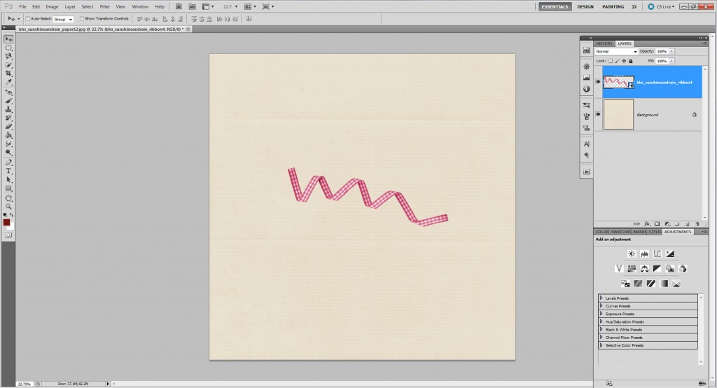
First, just go ahead and place a ribbon onto your paper. You can also use a string if you’d like.
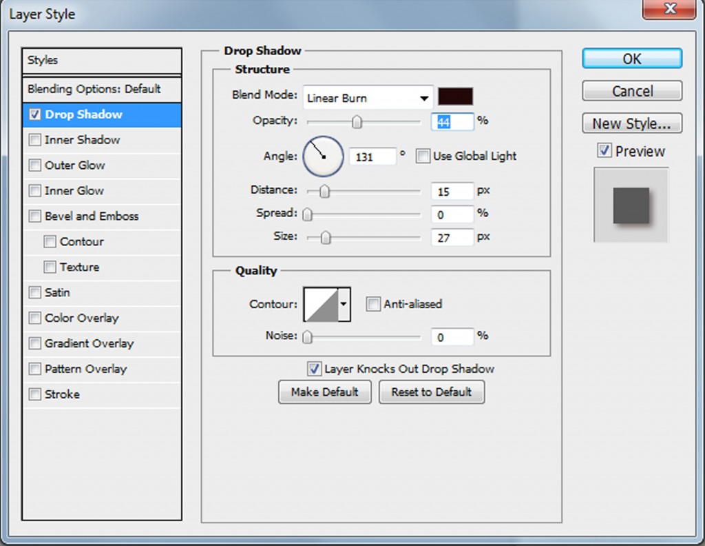
The next thing you’ll do is make sure you have that layer selected in your layers palette (see previous picture). Then you can do 1 of 2 things – either select a style to apply to your element or click on fx – drop shadow. In this case, I’d choose the ribbon basic shadow style for light paper. If you want to further adjust, click the fx -drop shadow option, and this window pops up. There are several things going on here. First you have the blend mode. I always use linear burn. I find it gives a more intense shadow, and it also picks up the color of whatever is underneath the item so it looks a bit more realistic. A lot of people also use multiply, so feel free to try out other ones if you’d like. Then is your opacity. This basically lightens or darkens your shadow. I keep it in the middle until I’ve got my other settings adjusted, then slide it to get the shadow just right. The distance slider is where you adjust how far away your item/element is going to appear to be from the page. A good rule of thumb here is that items on the bottom of the stack will have less distance because they are closer to the paper. You can create all kinds of different looks by adjusting this. If you want your page to look really paper scrapped, a short, clean distance works well. If you want everything really dreamy and floaty, adjust the slider further to the right. With the styles I’ve made here, you won’t have to mess with any of this if you don’t want to – I’ve given you the basic shadows I use. Then if you want to adjust, you can do so. Okay, the last thing I mess with is the size slider which gives you a more crisp shadow if it is to the left, and a more blurry shadow to the right. When you’ve got it how you want it, click ok.
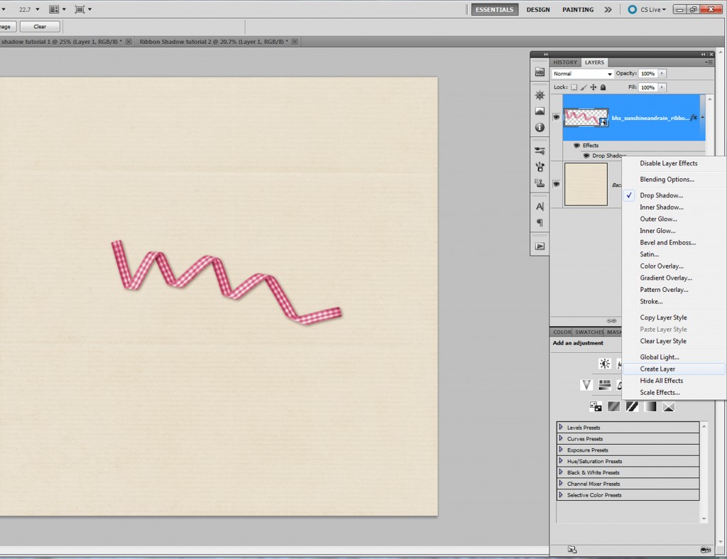
Okay, now we are going to start adding dimension to our ribbon. I have my ribbon selected in my layers palette. Now, right under the layer where it says drop shadow, I right click. Go almost to the bottom of the list of choices and select “create layer.” This gives us a separate layer with our shadow on it.
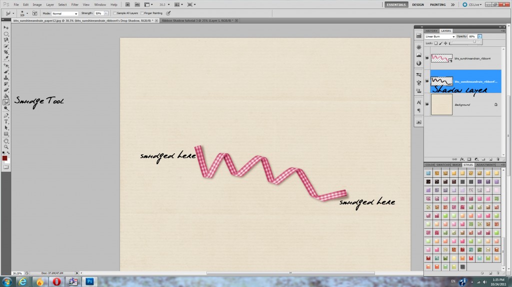
Now, select your shadow layer. You will then go over to your toolbar and choose the smudge tool. I’ve marked where the smudge tool is located in the picture below. You’ll want to play around with your brush size to get the look you want, but I usually use around a size 300 soft brush. You can change the brush at the top of the screen in the options listed. Then, just take your smudge tool and push the shadow around in parts where you want it to appear that the ribbon is coming up off the paper. In the pic below, I did the ends of the ribbons. You can do as much or as little as you want. The key with the smudge tool is to do small bits at a time, slowly. Every smudge is not going to look like you want, so then you can do a quick undo when needed. Just keep on smudging until your shadow looks good.
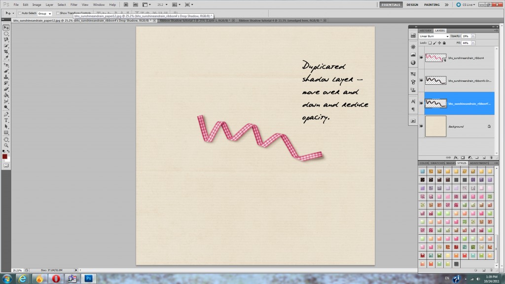
You can stop here, or you can keep going and add even more interest to your shadow. At this point, the shadow looks pretty darn good. But I want it to look even prettier. So, with my shadow layer selected, I hit ctrl J to duplicate the layer (or you can right click and select duplicate from the menu). Then I select my new layer, and I adjust the opacity to about 50ish%. Then select the move tool (arrow), and use your arrow keys to click over 4 or 5 pixels to the right and then 4 or 5 down. If you aren’t using these shadow styles, your shadow may be going in a different direction, and then you’d just move your duplicate shadow layer over in the direct your shadow is going. I Just find doing this gives my ribbon a bit more umph. You want to adjust your opacity till it is pretty light, but still there. And that is it! Now your ribbon looks like it is popping up off the page 🙂
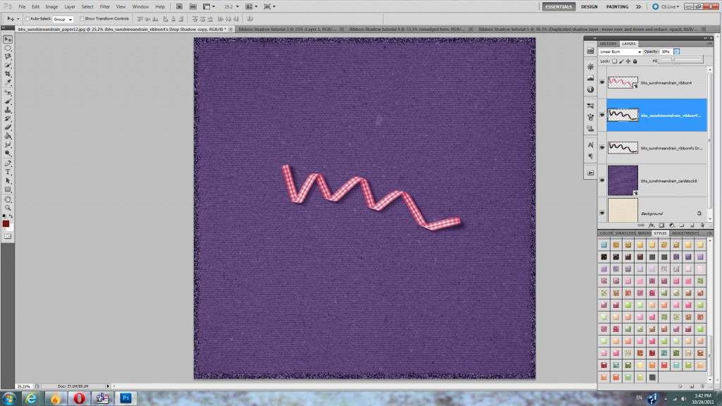
One more thing I want to show you is the same thing done on dark paper. The only difference here is that my shadow is just set at a lower opacity. For this I just chose the ribbon basic shadow dark paper style, then followed the steps above.
Well, that’s it for today’s tutorial! I hope it was helpful! Please leave a comment letting us know what other things you’d like to see tutorials for in the future. Also, if you make a page using the provided shadows or this tutorial, please show us your page on the Blue Heart Scraps FB page!
Thanks!!

